
This map is SO misleading & being misinterpreted imo. It appears to show that the red/yellow areas have more social housing doors than for example old town SC. You need to zero in on the areas to get a better comparison b/c a lot of the red/yellow areas are SFHs. For example

This map is SO misleading & being misinterpreted imo. It appears to show that the red/yellow areas have more social housing doors than for example old town SC. You need to zero in on the areas to get a better comparison b/c a lot of the red/yellow areas are SFHs. For example
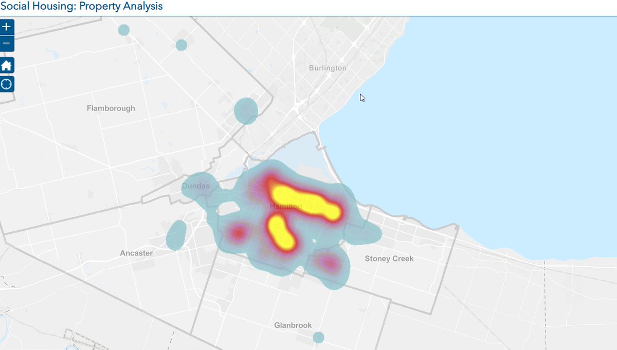
When you zoom in on SC, it shows yellow dots for the 5 building since those buildings are apartments. 5 buildings w/ 383 units of social housing are presently within a 1 km radius. (purple dots on my map w/ red dot at 5&13 Lake Ave). By comparison, If you were to zoom in on
a East Hamilton Ward 3 area on the Social Housing map, the area of Ottawa to Strathearne & Barton to Main, there are 140 buildings - that's why it is showing red/yellow on the heat map. It's also interesting to note, 2 bldgs are low rise apartments w/ the balance SFHs. /
No idea how many people are housed, but it looks to me that both areas likely house @ same # of people w/i the same 160 hectares of land. So while old town SC area has more units/hectares, the heat map is illustrating buildings/hectare. Correct me if I'm wrong please.

All the red/yellow areas turn to blue/yellow dots when you zoom in. Yellow dots are apartments and blue are sfhs/semis/towns. So basically, the "heat" map is an indicator where we have low density social housing. Not what I thought when I first saw it


@SaundersWard10 Wow, very interesting, thanks for the analysis, your assessment based on empirical data sure paints a very different picture than what was portrayed. Appreciate the work on this!