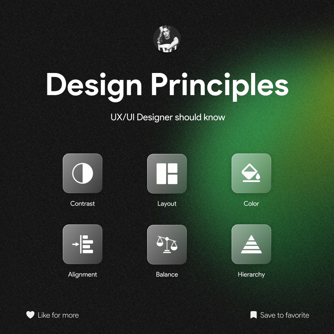
6 Design Principles that every UX/UI Designer should know ✅ Thread 🧵
10
81
422
53K
390
Download Image
1/ Contrast is key to creating visual hierarchy. It helps users distinguish elements, guiding them through the interface. Use contrast in text, color, and size to highlight important information or actions. It's the secret sauce for readability and user engagement

@_vargaalex This thread on design principles is fantastic! Here are a few more principles that can make a big difference in user experience. Consistency, simplicity, accessibility, visual hierarchy, feedback, and flexibility are key factors to consider.


@_vargaalex Great thread post, @_vargaalex