
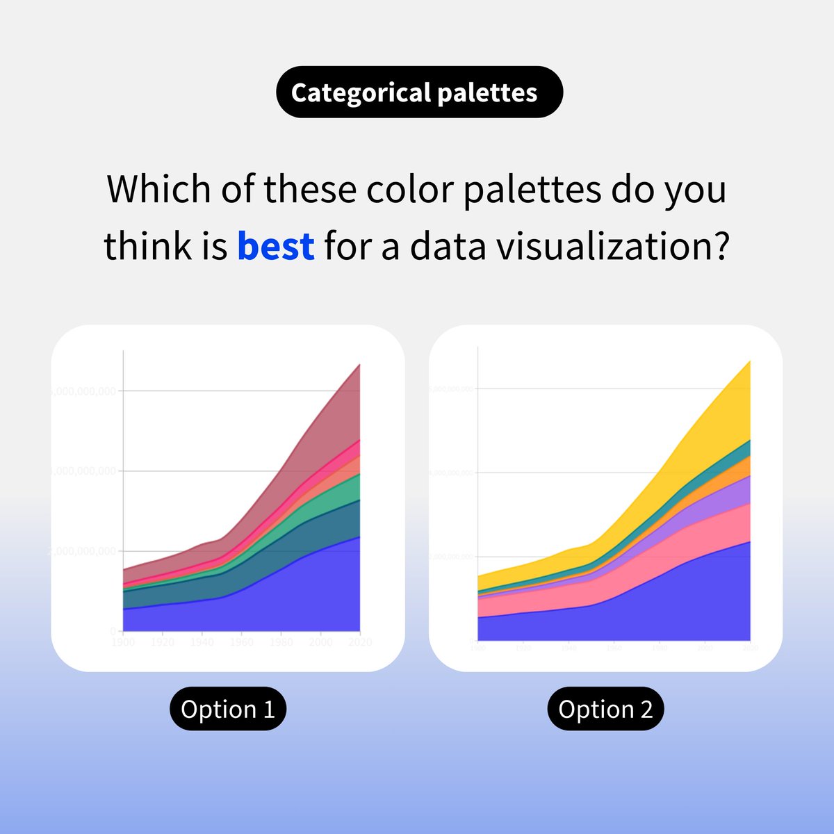
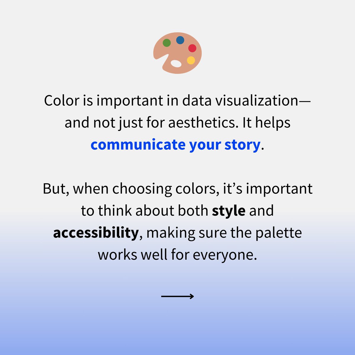
(1/2) Color is an essential part of data storytelling - but are you making wise color choices? Here are some simple tips to ensure your color palette makes your data visualizations stand out 📊🎨
1
2
9
2K
7
Download Image
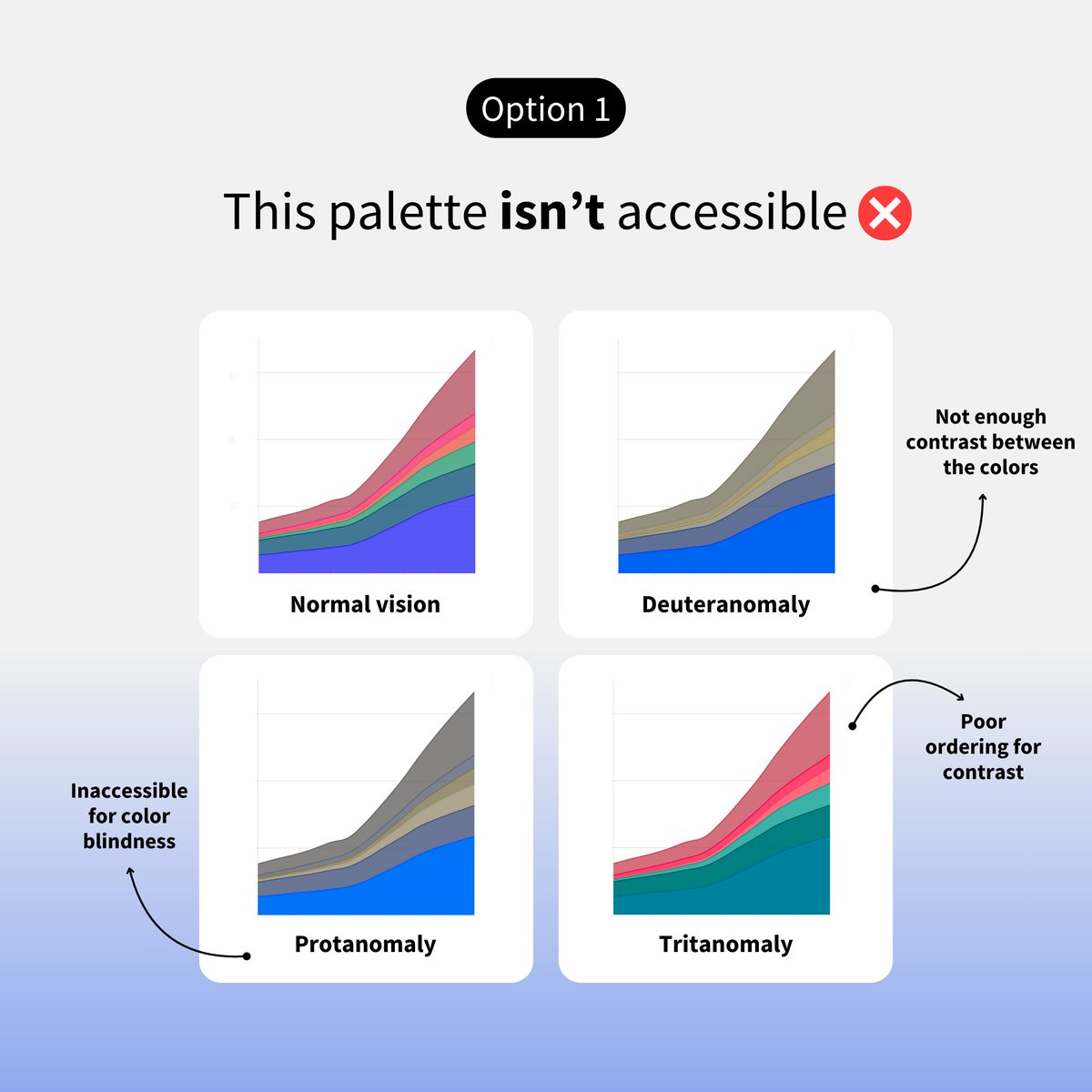
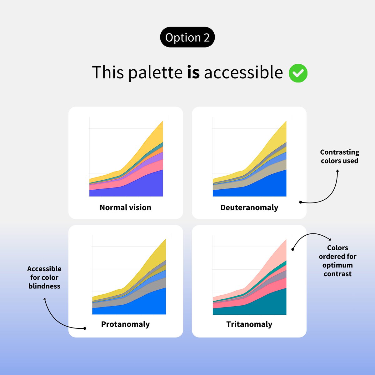
(2/2) Here's our simple checklist for making better decisions for categorical palettes. Do you have any other tips for choosing effective colors for charts? Share them in the replies!


@f_l_o_u_r_i_s_h Are your colors choices culturally appropriate? Are your color choices reinforcing biases or stereotypes? (as in @jschwabish & @fleecealeece 's Do No Harm guides urban.org/research/publi…)