Search results for #CSSGrid

✨ Learned CSS Grid today! Covered: 1️⃣ Basic Grid (3x3) 2️⃣ Column sizes 3️⃣ Gaps 4️⃣ Item placement 5️⃣ Template areas 6️⃣ Auto-fit & minmax 7️⃣ Alignment & justification CSS Grid feels like a layout superpower! 💪✨ Thanks @Hiteshdotcom sir 🙏 #WebDev #CSSGrid #100DaysOfCode


تقنيًا، تم الانتقال من display: flex إلى display: grid داخل media query مخصص للشاشات الصغيرة. باستخدام grid-template-columns: 1fr 1fr، تمكنا بسهولة من إنشاء شبكة من عمودين متساويين، مما يجعل كل فئتين تظهران في سطر واحد. #CSSGrid #تطوير_ويب


Day 18 – Flexbox + Grid in Action Today I combined Flexbox & Grid to build a simple responsive layout: ✅ Flexbox → Navbar ✅ Grid → Sidebar + Content + Ads Key CSS: main { display: grid; grid-template-columns: 200px 1fr 150px; } #FrontendDev #CSS #Flexbox #CSSGrid
Positioning in CSS Grid 🔳 Want a grid item to be bigger than others? Use row & column spanning: grid-column: 1 / 3; /* spans across 2 columns */ grid-row: span 2; /* spans 2 rows */ This helps build dashboards, featured sections, hero layouts. #CSS #CSSGrid #FrontendDev

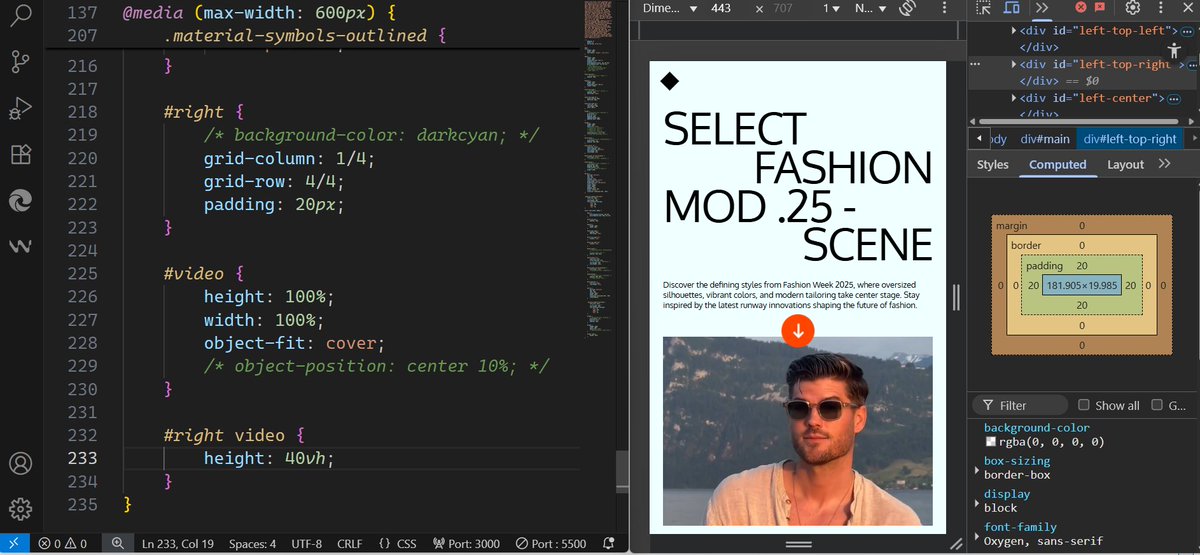
Built a responsive layout with CSS Grid 🕸️! Fluid typography, video integration, & scalable icons. CSS Grid makes complex design easy! #WebDev #CSSGrid #ResponsiveDesign

¿Cómo optimizar el rendimiento de Grid Layout en elementos con content-overflow: visible? ¿Es mejor usar clip-path o considerar alternativas para evitar reflows innecesarios cuando se manejan contenidos que exceden sus celdas? #CSSGrid #Performance #WebDev

Day 7 ✅ Added a hero section to my “studysinc” project today! Kept it simple—just focusing on learning and making progress step by step. Excited to slowly see the project take shape! #WebDevelopment #LearnInPublic #CodeNewbies #100DaysOfCode #CSSGrid

Created a Responsive 2-column layout that switches to 1-column on mobile #latenightcoding #cssgrid codepen.io/upasanaasopa/f…
come together and create something tangible from nothing. Making progress feels amazing 🚀. #CodeNewbies #CSSGrid #codingJourney #coding
¡CSS Grid Pro Tip! 🚀 ¿Quieres crear columnas de igual tamaño que se adapten a un mínimo y máximo? Usa fr con minmax(): css grid-template-columns: repeat(auto-fit, minmax(200px, 1fr)); Esto asegura flexibilidad y legibilidad en cualquier pantalla. #CSSGrid...


Built a Portfolio Layout using CSS Grid. Clean, responsive, and perfect for showcasing work. Loving the power of Grid.. #CSSGrid #WebDevelopment #Frontend


📐 CSS Layout Gets Superpowered! *Subgrid* in CSS Grid finally provides true two-dimensional alignment for nested components, eliminating painful manual positioning and redundant sizing. #CSSGrid #WebDev smashingmagazine.com

Responsive layout using a mix of CSS Flexbox, Grid, and some creative styling. #WebDevelopment #CSS #Flexbox #CSSGrid #Frontend #CodingJourney #WebDesign #ResponsiveDesign #HTML


CSS Grid es *la* herramienta para layouts bidimensionales. Olvídate de floats/flexbox complejos para estructuras complejas. Define áreas con grid-template-areas y posiciona elementos explícitamente. Control total, menos hacks, mejor rendimiento. #CSSGrid...


CssGrid.online @cssgrid_online
5 Followers 0 Following