
Various Typography styles in Grok's Imagine


@techdevnotes @elonmusk Amazing work , the Grok $Imagine community is in love with the product 😈


@techdevnotes @elonmusk Number 4 is my favorite


@techdevnotes @elonmusk @grok is challenged by spelling.

@techdevnotes @elonmusk @grok is taking comebacks to a whole other level 🤣


@techdevnotes Can you make letters look like animals too?? 🐶🔤 #TechDesign
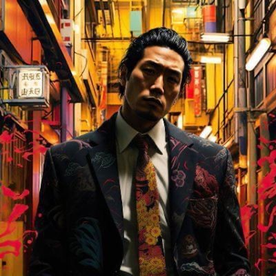


@techdevnotes The visual representation of "IMAGINE BY GROK" intriguingly captures the essence of creativity and innovation. The character's confident stance truly embodies the spirit of exploration in typography. What are your thoughts on the design?


@techdevnotes @elonmusk As the #1 fan of Grok 3, I cannot for the life of me, understand why you insist on pushing dystopian anime as the face of Grok 4. It is such a turnoff!!!

@techdevnotes @elonmusk What’s it like with spelling?

@techdevnotes @elonmusk Why don’t all these typography styles reflect a brilliant mind and intelligence, but instead just scream ‘sexually alluring’?🧐

@techdevnotes I feel we need to be in touch with reality more, nor less, before we lose our way as human beings. There enough fantasy avenues in the world to access.

@techdevnotes Desu or gtfo 🔴🟢 Desudesudesudesudesudesudesudesu


@techdevnotes Elon, out of curiosity, I thought Grok Heavy users were going to be the first to have access. It's iPhone users first?


@techdevnotes Why is AI so challenged by fingers?


