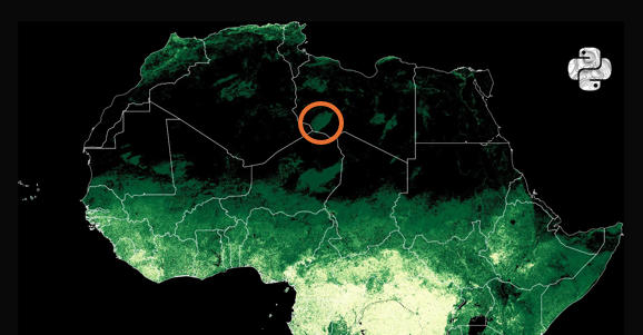
Here is a thread of my favourite maps of Africa. Let me know which you like most and give me your best theories for how thel all fit together. Starting with population. 1/10

120
1K
12K
3.0M
6K
Download Image


@PythonMaps Dark green = 0% forest Not my favorite map.

@PythonMaps This one is counter-intuitive in that one expects more green, = more tree cover, but of course it's exacty the opposite. Perhaps reverse the colours?
@PythonMaps The hue for forests should have been the other way round.


@PythonMaps After 3 years in Mozambique - nth to sth - there are many trees, but few forests.

@PythonMaps So the greener, the less trees. Stop smoking trees.

@PythonMaps I went over here on Google Earth and I couldn't see any trees.