
6 Design Principles that every UX/UI Designer should know ✅ Thread 🧵
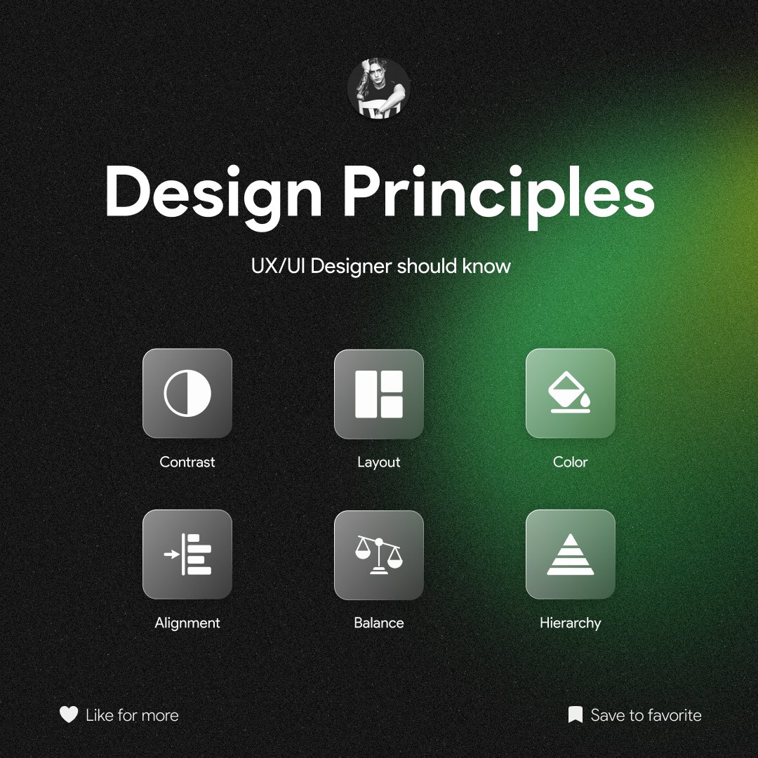
1/ Contrast is key to creating visual hierarchy. It helps users distinguish elements, guiding them through the interface. Use contrast in text, color, and size to highlight important information or actions. It's the secret sauce for readability and user engagement
2/ Layout is the foundation of your design. It should be intuitive and guide users seamlessly. Consider content flow, spacing, and responsiveness. Balance elements harmoniously, so users can navigate effortlessly. A clean, well-structured layout is a user's best friend!
3/ Color can evoke emotions and set the tone for your design. Choose a color palette that aligns with your brand and resonates with your target audience. Ensure accessibility by considering color contrast and readability for all users. Color is a powerful tool; use it wisely!