
This map is SO misleading & being misinterpreted imo. It appears to show that the red/yellow areas have more social housing doors than for example old town SC. You need to zero in on the areas to get a better comparison b/c a lot of the red/yellow areas are SFHs. For example

This map is SO misleading & being misinterpreted imo. It appears to show that the red/yellow areas have more social housing doors than for example old town SC. You need to zero in on the areas to get a better comparison b/c a lot of the red/yellow areas are SFHs. For example
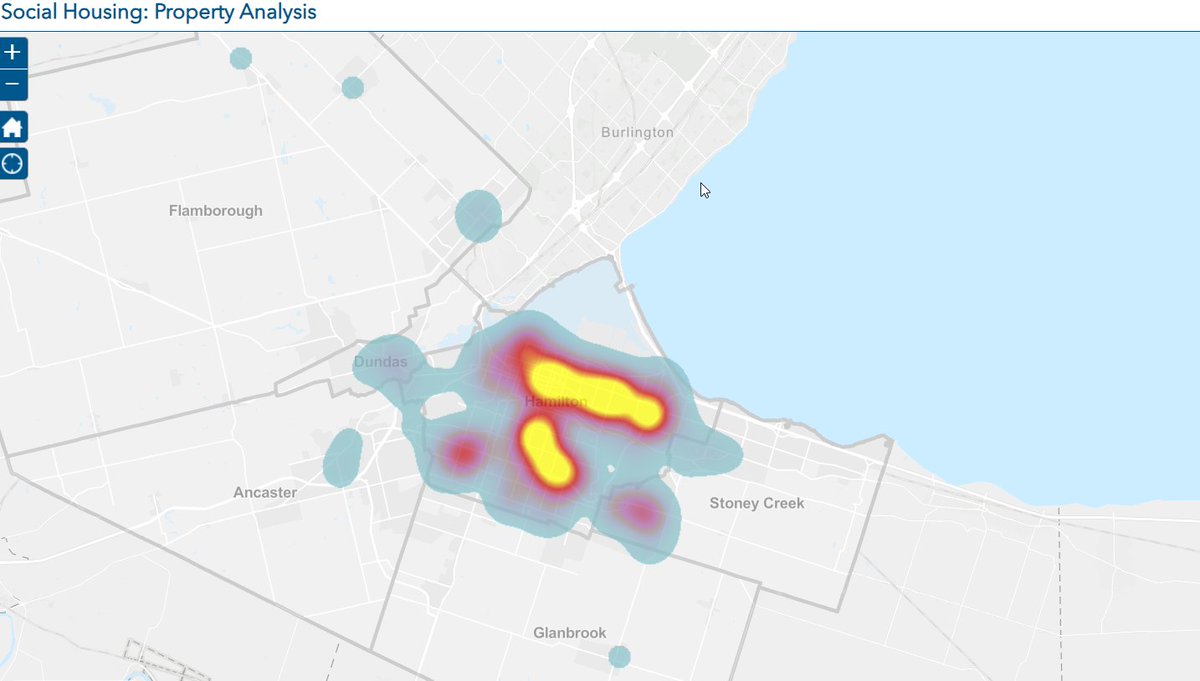

@SaundersWard10 There is a well known cluster of towere near city hall.
@ejcardno1 Are you referring to these 3 highlighted buildings ? If so, it's interesting to see that when you zoom back out they fall outside of the 'heat' map since they are 'only' 3 "units" on the map
