
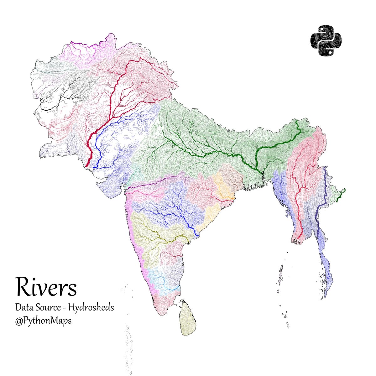
Another thread of maps I like. This time we are looking loosely at the Indian sub continent. Included are India, Pakistan, Afghanistan, Nepal, Bhutan, Bangladesh, Sri Lanka and Myanmar. First up, Rivers! 1/13
Population - using data from @KonturInc 2/13

Forests - using everyones favourite colourmap. 😉3/13

Grasslands. Data comes from Global Land Cover-SHARE (GLC-SHARE) database. 4/13


@PythonMaps you just need to flip the color scale and it would be fine lol! please!

@PythonMaps Should’ve inversed the color gradient. Misleading.

@PythonMaps Misleading colour palette & defeats the purpose of the chart.

@PythonMaps Darkest green for the least percentage cover is just counter-intuitive. Color gradient should have been reversed.

@PythonMaps should've reversed the colour scheme this feels like all of india is covered except for where it is

@PythonMaps Colors need to be in reverse order. Dark green for 💯%


@PythonMaps I feel like your reply is to me from earlier this week and I can appreciate it. haha! --- the white super dense areas correlate with the other maps, makes sense. Who am I to disagree!

@PythonMaps Green should represent trees and white should represent desert. Isn't it?

@PythonMaps Suggestion: Reverse the colour density. The current colours show more green in arid areas.


@PythonMaps The color scheme is a bit confusing. Lol I thought India has transformed into a woodland till I saw that legend.


